When participating in conversations on open source project your technical background or history in the company doesn’t matter as much as how you conduct yourself and the value you provide in the discussion.
With open source work you have to let strangers look at your initial sketches. This forces you to articulate and present your work better — clearly explaining ideas and anticipating questions.
By designing in the open you expose yourself to multiple perspectives and ultimately the work is better for it.
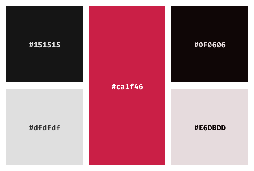
We often see things like the road, our office chair or a shadow and assume they’re black, when in fact they’re not. As seen in Wayne Thiebaud’s work, shadows are some of the most saturated part of a work. Most blacks we see in our lives are a colored-dark-gray.
An example of saturating grays
Stay away from #000000 pure black, add a bit of color to it. More saturation for darker colors and much lesser for light ones.
There has been a trend to reduce the color contrast of text on the web. As screens have improved, designers have started using lighter typefaces and lower contrast ratios. But, as more people use devices in outdoor environments where screens aren’t as clear to look at, there is a need for text to be be better legible for everyone. The physical screen and the context it is used in should be considered when picking colors.
Color contrast explained
The baseline typography and colors should work for most users regardless of their eyesight. Contrast ratios between two colors are:
1:1 when the background and text are the same color
21:1 when its black text on a white background
4.5:1 is the minimum ratio for clear type
7:1 is the recommended contrast to aid those with impaired vision
Note that the recommendations are minimums and shouldn’t be treated as starting points.
I’ve been involved in the process of instating a design system twice. First, with the short-lived attempt to move the MediaWiki platform to mediawiki.ui. And second, replacing mediawiki.ui and whatever else MediaWiki was using to OOUI.
While the first attempt was limited to a small CSS file and KSS generated documentation, the second one came with a full-fledged demos page and a styleguide to go with it. MediaWiki is in the process of transitioning once again, now to Vue.js. This time though, things are different, the style guide remains in place, it is only the implementation of the components that’ll change.
So when I first heard about the Design Systems Handbook on the Design Better podcast I was immediately interested. Large legacy products like MediaWiki have long suffered from bespoke designs for every corner. Design systems that can scale-up help build products faster.
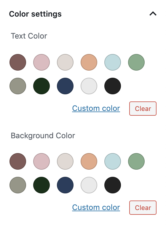
One of my favorite features of the Gutenberg block editor is the editor color palette. It allows themes to register a color palette that is shown in the block editor whenever a block needs to choose a color.
Allowing the theme to have a say in the styling of the content of the post is a powerful idea. It helps guide the user’s design choices while still allowing them freedom to make changes. When working on Zuari, it was important for me to get this right since the theme is otherwise just black and gray.
Since I am not very good at colors, I collected over a hundred references on Pinterest to pick and tweak from.
Once we have the colors picked and named (This can be tricky. What is ecru?) we need to let WordPress know that our theme would like to register a palette, and add our colors to it:
Next, we’ll need to add two CSS classes for each of these colors so that they can be used on the different blocks as background and foreground colors. The naming convention for these classes is has-{slug}-color and has-{slug}-background-color:
That’s it! This will add the color palette to the block inspector for any blocks that need color, and show the right colors in the website once they’re selected.
I hope that WordPress adds these colors as options in the Customizer panels as well, allowing for more design guidance coming from the theme. I’ve been thinking about WordPress themes as design patterns and guidelines rather than skeletons for a website. I’ll be writing about this soon.
The system uses points not pixels because the pixel density of devices wary and we want to keep our designs consistent across different densities. iPhones for example could be rendering 2x or 3x the number of pixels. So, we design for the smallest size, and get perfect rendering by multiplying by 2 or 3.
Typography Font sizes may stray from multiples of 8 but the line heights shouldn’t so as to maintain vertical rhythm. For example, a font size of 12px is acceptable as long as the line height is 16px.
Icons Should be constructed in the 8pt grid and exported for higher density screens.
Layout For the horizontal layout, customize your column grid library or settings to make sure the gutters are a multiple of 8. Setup variables to use later when setting dimensions, margin and padding:
:root {
  --small-space: 8px;
  --medium-space: 16px;
  --large-space: 24px;
  --x-large-space: 32px
  /* and so on */
}
Use multiples of 8 to define dimensions, padding and margins of all elements. Set the root font size to 16px and use 0.5rem increments to build the layout. By limiting your spacing options and font size options you get a more consistent UI and faster coding times.
I’m a big proponent of sketching ideas on paper instead of rushing to open Photoshop or Illustrator. I think it’s important to have the freedom to get good and bad ideas out of your head without needing them to feel polished or final.
Over the last few weeks I have been giving the WinkJS’s JSDoc theme some much needed attention. When we started using JSDoc for WinkJS packages we used the docdash theme. It was clean and simple, exactly what we needed at the time. After we update the main website though, the theme needed to look more on brand and so we forked it to add our colors and a navigation bar on top. We want to add tutorials for our packages soon and this means some more layout and design changes.
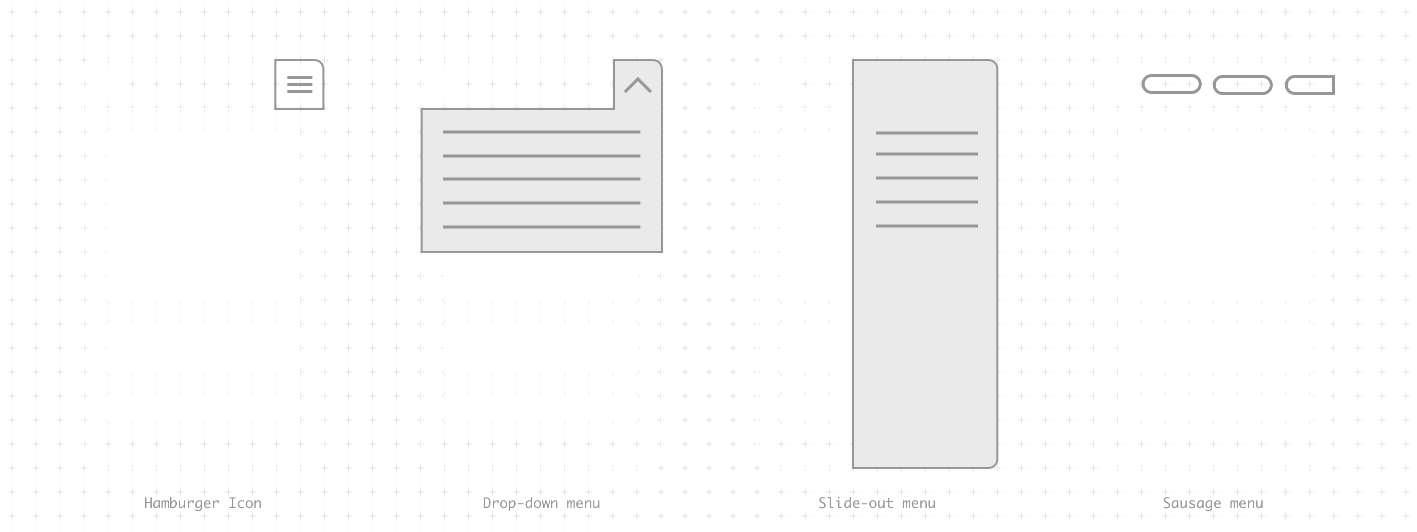
After initially adding the navigation bar, everything looked alright on desktop, but on mobile the two menus were fighting for attention—one would open a dropdown with the site-wide navigation, and the other would open a slide out with the API’s table of contents. The icons were quite close to each other and it was a mess.
Diagram of a few mobile menu options
So, when Siddharth showed me what sausage links were, I knew they would be perfect for this problem. I did some research and found some other documentation websites using them too. It is elegant and uses a simple horizontal scroll to show more items in the navigation. The trick is to be able to cut-off one of the menu items and show a fade on top of it so that its clear that there is something else there to see. Different screen widths mean that you can’t always control what is hidden so I decided to show a bigger fade on the left.
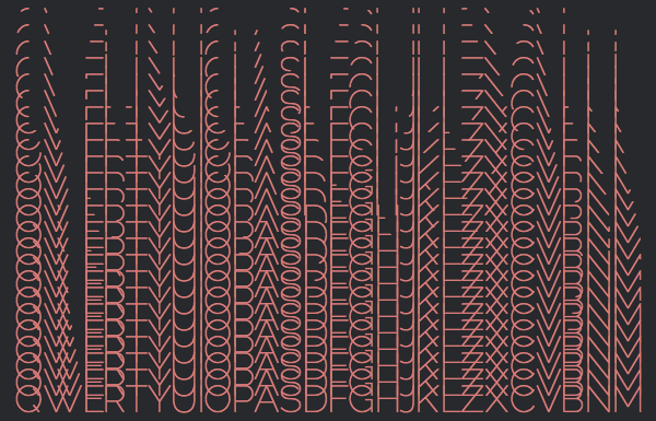
After building Cascade in a frenzied hack night, we decided to put it up as an entry for Mozilla Game On. I wanted to learn about and showcase CSS3 animations. There were obviously a lot of 3D matrix transforms going in to the rotating cubes, but there were other subtler CSS3 animations across the website too.
One effect that I wanted to achieve was to render the letter being played as if it were being written by hand. Line by line and exactly the way a human would draw the letters.
I quickly realized that there isn’t going to be a straightforward way to do this. The animation had to be perfect and I wanted the text to be selectable afterwards so Flash and animated GIFs were out of the question. After brainstorming with neena we came up with a couple of solutions.
Progressive SVGs
SVG is just XML, right? So, if we just render the XML progressively we’ll have our animation! Err…NO! Life isn’t that simple, neither are the shapes of fonts. The SVG files of most fonts are pretty complex. They create shapes and subtract/add/intersect other shapes out of it. Get rid of one node in the curve and Latin will start looking like Devanagari. Not exactly what we want.
CSS Masking
How about covering the letter with a DIV, that has multiple DIVs inside it, that have keyframe animations set in CSS that would slowly unmask parts of the character. We’d have to write at least 2-3 ‘unmaskers‘ for each character, not to mention that it would be next to impossible to do characters like X and Q where there is an overlap in lines. This is theoretically doable, but with the vast differences font rendering across browsers and operating systems it could never come out right.
Canvas
Let’s do the animation using arcs and lines in Canvas and once the animation is complete switch it out with a font that looks exactly like the one we drew on Canvas. So, all we need to do is design a font that can be made with simple arcs and lines, make animations for it in Canvas, convert it into a web fonts to be used as @font-face and we are done! This is starting to sound desperate.
After failed attempts at achieving the effect, I suddenly realized that we have a typeface designer in the family. A simple solution came to my mind and I called Pooja (Didi) asking for a big favor. Frame-by-frame animation seemed like the correct choice for such animation so I asked Didi to make 24 different fonts each with one frame of the animation.
She had to go to Delhi that week but was able to slice everything up and send it just in time for the Game On entry! I wrote some JavaScript to run through the fonts frame-by-frame and Bhaukal was born. Bhaukal roughly translated to ‘extreme swagger’ in local Lucknow lingo, that is what I thought any website would have if it has such an animation 😛
We chose Raleway to begin with as it was simple, clean and easy to cut. New fonts can easily be added as long as someone is willing to cut all 24 frames of the 26 character by hand. Even though it sounds like a lot of work, the result I think was worth it. You can check out demos or look into the code and contribute more fonts. Wait a second! Was there an easier way to do this?
When I went to Bangalore to pack up my stuff, lut4rp‘s home had been converted into a hacker space with YuviPanda and GeneralMaximus hanging around. I didn’t have too much client work and realized that it was the best time to make a design contribution to open source and familiarize myself with the process.
Yuvi was (and still is) working on the Wikimedia Commons application. He wasn’t completely happy with the icon and I decided to make one according to the iconography design guidelines in the Android design docs. The logo has a pretty complicated shape but I wanted to keep it consistent with the other launcher icons with the slight depth on top and light shadows.
After completing the design I sent my first ever pull request (I have no idea why I was scared to do this earlier) which after a couple of changes and iterations finally got merged to the repo. I am not completely happy with the rendering of it, but it looks fine on smaller sizes, guess I’ll change the shading a bit and send another pull request. I am glad that I got past this hurdle and have been sending more (but still trivial) pull requests to other projects as well. Hope this streak keeps going 🙂
After publishing the Customizing iTerm2 post I was really bothered by the way the font was looking in the code block. Some people are more comfortable with anti-aliased fonts all the time, I personally can’t write or read code like that. I like looking at Monaco in 10pt without any anti-aliasing, just plain old pixels, so this was obviously bothering me.
I did some poking around, asked Google, asked my sister but there seems to be no solution for it. Nothing that’ll work properly on every browser (why isn’t that surprising). There was something called font-smooth in the CSS3 specification in 2002 but they later removed it from the standard. MDN has a page on it only stating that they don’t implement it. There is however a purely webkit alternative called –webkit-font-smoothing that lets you do almost the same thing. I found a pretty extensive blog post about it which came with a demo page. I found some hacks to get fake anti-aliasing that were pretty interesting, but nothing to get rid of it.
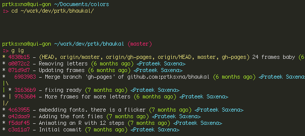
I recently switched to iTerm2 from the normal MacOSX Terminal. The main reason for the switch was the split window feature that I really needed in my Terminal (Emacs spoils everyone). iTerm has some really nice features and is customizable. I used to use two screens on my Mac Mini and iTerm played well with that too.
I’ve been a great fan of Monokai the color theme since I bought a TextMate license in high school. I even ported it for Emacs when I switched from TextMate. There was no reason to not use it for iTerm, so I made the color theme for iTerm.
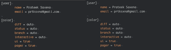
I’ve also made a few customizations to my .bash_profile and.gitconfig to neatly typeset information and take advantage of the beautiful colors.
[color]
        diff = auto
        status = auto
        branch = auto
        interactive = auto
        ui = true
        pager = true
[color "branch"]
        current = yellow reverse
        local = yellow
        remote = green
[color "diff"]
        meta = yellow
        frag = magenta
        old = red
        new = green
[color "status"]
        added = yellow
        changed = green
        untracked = cyan
[alias]
        tree = log --graph --pretty=oneline
        lg = log --color --graph --pretty=format:'%Cred%h%Creset -%C(yellow)%d%Creset %s %Cgreen(%cr) %C(bold blue)<%an>%Creset' --abbrev-commit

