There has been a trend to reduce the color contrast of text on the web. As screens have improved, designers have started using lighter typefaces and lower contrast ratios. But, as more people use devices in outdoor environments where screens aren’t as clear to look at, there is a need for text to be be better legible for everyone. The physical screen and the context it is used in should be considered when picking colors.
Color contrast explained
The baseline typography and colors should work for most users regardless of their eyesight. Contrast ratios between two colors are:
1:1 when the background and text are the same color
21:1 when its black text on a white background
4.5:1 is the minimum ratio for clear type
7:1 is the recommended contrast to aid those with impaired vision
Note that the recommendations are minimums and shouldn’t be treated as starting points.
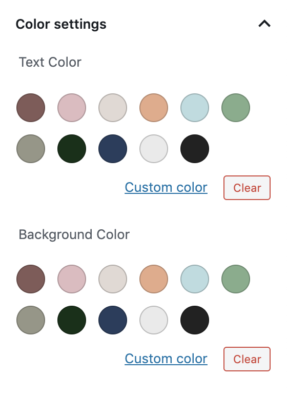
One of my favorite features of the Gutenberg block editor is the editor color palette. It allows themes to register a color palette that is shown in the block editor whenever a block needs to choose a color.
Allowing the theme to have a say in the styling of the content of the post is a powerful idea. It helps guide the user’s design choices while still allowing them freedom to make changes. When working on Zuari, it was important for me to get this right since the theme is otherwise just black and gray.
Since I am not very good at colors, I collected over a hundred references on Pinterest to pick and tweak from.
Once we have the colors picked and named (This can be tricky. What is ecru?) we need to let WordPress know that our theme would like to register a palette, and add our colors to it:
Next, we’ll need to add two CSS classes for each of these colors so that they can be used on the different blocks as background and foreground colors. The naming convention for these classes is has-{slug}-color and has-{slug}-background-color:
That’s it! This will add the color palette to the block inspector for any blocks that need color, and show the right colors in the website once they’re selected.
I hope that WordPress adds these colors as options in the Customizer panels as well, allowing for more design guidance coming from the theme. I’ve been thinking about WordPress themes as design patterns and guidelines rather than skeletons for a website. I’ll be writing about this soon.