Animating Type: Hacks when CSS3 doesn't cut it
After building Cascade in a frenzied hack night, we decided to put it up as an entry for Mozilla Game On. I wanted to learn about and showcase CSS3 animations. There were obviously a lot of 3D matrix transforms going in to the rotating cubes, but there were other subtler CSS3 animations across the website too.
One effect that I wanted to achieve was to render the letter being played as if it were being written by hand. Line by line and exactly the way a human would draw the letters.
I quickly realized that there isn’t going to be a straightforward way to do this. The animation had to be perfect and I wanted the text to be selectable afterwards so Flash and animated GIFs were out of the question. After brainstorming with neena we came up with a couple of solutions.
Progressive SVGs
SVG is just XML, right? So, if we just render the XML progressively we’ll have our animation! Err…NO! Life isn’t that simple, neither are the shapes of fonts. The SVG files of most fonts are pretty complex. They create shapes and subtract/add/intersect other shapes out of it. Get rid of one node in the curve and Latin will start looking like Devanagari. Not exactly what we want.
CSS Masking
How about covering the letter with a DIV, that has multiple DIVs inside it, that have keyframe animations set in CSS that would slowly unmask parts of the character. We’d have to write at least 2-3 ‘unmaskers‘ for each character, not to mention that it would be next to impossible to do characters like X and Q where there is an overlap in lines. This is theoretically doable, but with the vast differences font rendering across browsers and operating systems it could never come out right.
Canvas
Let’s do the animation using arcs and lines in Canvas and once the animation is complete switch it out with a font that looks exactly like the one we drew on Canvas. So, all we need to do is design a font that can be made with simple arcs and lines, make animations for it in Canvas, convert it into a web fonts to be used as @font-face and we are done! This is starting to sound desperate.
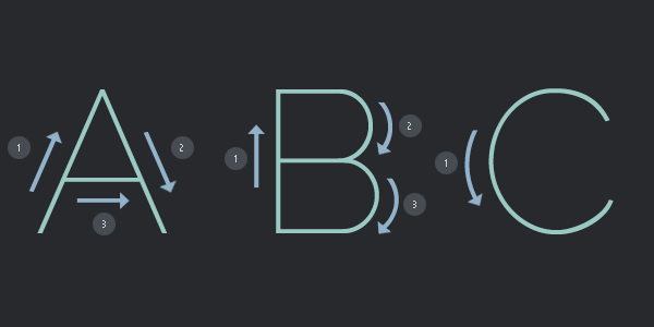
After failed attempts at achieving the effect, I suddenly realized that we have a typeface designer in the family. A simple solution came to my mind and I called Pooja (Didi) asking for a big favor. Frame-by-frame animation seemed like the correct choice for such animation so I asked Didi to make 24 different fonts each with one frame of the animation.
She had to go to Delhi that week but was able to slice everything up and send it just in time for the Game On entry! I wrote some JavaScript to run through the fonts frame-by-frame and Bhaukal was born. Bhaukal roughly translated to ‘extreme swagger’ in local Lucknow lingo, that is what I thought any website would have if it has such an animation 😛
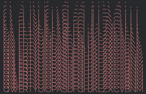
We chose Raleway to begin with as it was simple, clean and easy to cut. New fonts can easily be added as long as someone is willing to cut all 24 frames of the 26 character by hand. Even though it sounds like a lot of work, the result I think was worth it. You can check out demos or look into the code and contribute more fonts.
Wait a second! Was there an easier way to do this?