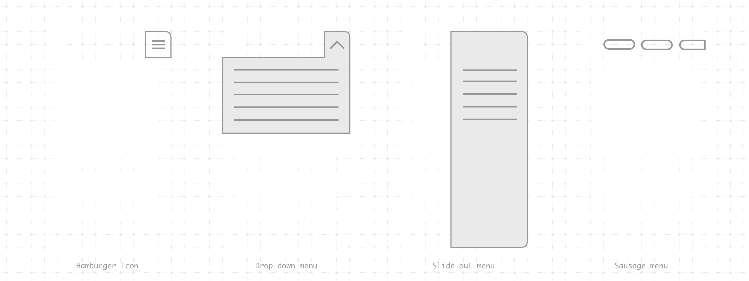
Sausages & Hamburgers
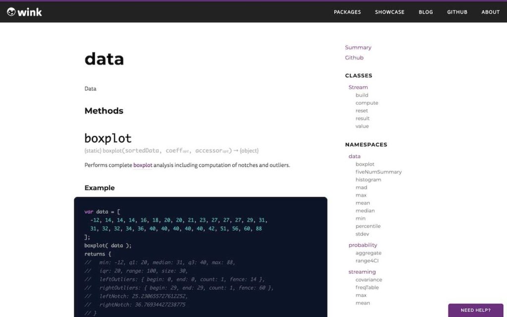
Over the last few weeks I have been giving the WinkJS’s JSDoc theme some much needed attention. When we started using JSDoc for WinkJS packages we used the docdash theme. It was clean and simple, exactly what we needed at the time. After we update the main website though, the theme needed to look more on brand and so we forked it to add our colors and a navigation bar on top. We want to add tutorials for our packages soon and this means some more layout and design changes.
After initially adding the navigation bar, everything looked alright on desktop, but on mobile the two menus were fighting for attention—one would open a dropdown with the site-wide navigation, and the other would open a slide out with the API’s table of contents. The icons were quite close to each other and it was a mess.

So, when Siddharth showed me what sausage links were, I knew they would be perfect for this problem. I did some research and found some other documentation websites using them too. It is elegant and uses a simple horizontal scroll to show more items in the navigation. The trick is to be able to cut-off one of the menu items and show a fade on top of it so that its clear that there is something else there to see. Different screen widths mean that you can’t always control what is hidden so I decided to show a bigger fade on the left.
🌭🍔😉

Hey, Prateek—good to have you cross-posting to Indieweb.xyz. It will be interesting
to see if sausage links stay or if they are a fad. It’s interesting that
browsers haven’t adopted them for crowded tabs (or, perhaps, it seems that they
moved away from hidden tabs… can’t recall.)
At any rate, you have a nice design here. Keep up the great work!