🔖 Design Tip: Never Use Black (archive) by Ian Storm Taylor
We often see things like the road, our office chair or a shadow and assume they’re black, when in fact they’re not. As seen in Wayne Thiebaud’s work, shadows are some of the most saturated part of a work. Most blacks we see in our lives are a colored-dark-gray.

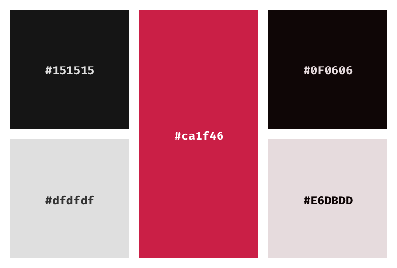
Stay away from #000000 pure black, add a bit of color to it. More saturation for darker colors and much lesser for light ones.